

Case Study - Turning an early MVP into a product people could trust
I joined while the product was still rough and helped shape the interface, design system, brand, website, and launch materials into something the team could put in front of customers with confidence.
- Client
- DIVACS
- Year
- Service
- Product Design, Design System, Brand Identity, Frontend Development
Overview
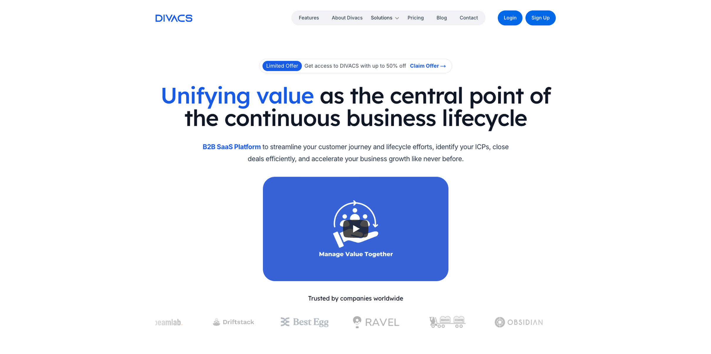
DIVACS is a B2B SaaS platform that helps companies quantify, track, and communicate the value they create across customer and vendor relationships — a system of record for business value, from pre-sale through post-sale.
I joined DIVACS in May 2024, the product was still taking shape. The core workflows existed, but the experience felt uneven and unfinished. The team needed more than working screens. They needed a product people could understand, trust, and take seriously.
What I did
- Product Design
- UX Research
- Design System
- Brand Identity
- Frontend Development
The Goal
The idea genuinely excited me. Every B2B company talks about delivering value, but almost none can point to a system that actually tracks it. If DIVACS delivered on that promise, it could change how businesses operate.
But at the pre-seed stage, the product is the pitch. Investors, early customers, and prospects all needed to look at the interface and think: these people know what they are doing. If the interface feels rough, the whole company feels rough — regardless of what is underneath.
The goal was to make DIVACS look and feel as credible as the idea behind it.
The Gap
Before I touched any pixels, I spent weeks immersing myself in the domain. I sat in on customer calls, studied the competitive landscape, reviewed pitch decks, and read through product documentation to map where users got stuck.
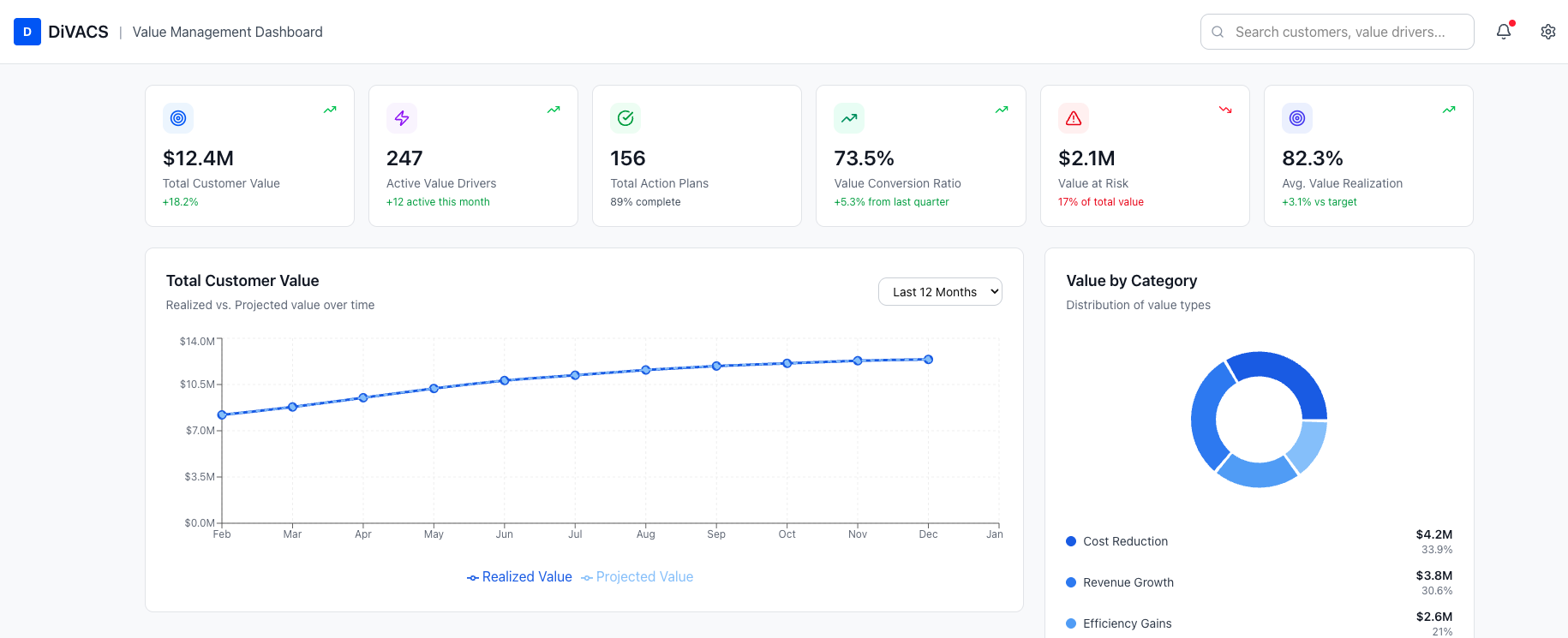
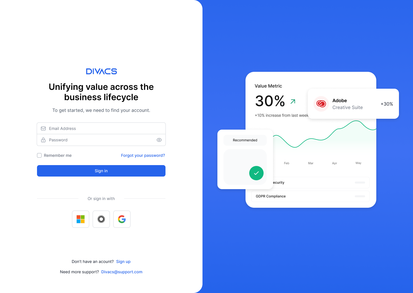
The biggest insight: DIVACS was not a dashboard. It was a strategic decision-making layer. Users were executives and VPs who did not have time to interpret a messy screen. The interface needed to communicate authority and clarity, not just display data.
The MVP had the functionality — value drivers, business cases, insights — but the experience was inconsistent. Layouts shifted between screens, components felt disconnected, and the visual hierarchy was unclear. When the team explained the product live, it made sense. When someone navigated it alone, the story fell apart.
The Gamble
There was a tempting path: stop everything and rebuild from scratch. But time was the most expensive resource. The team needed to keep shipping.
I used Tailwind UI as a practical foundation, then built a design system in Figma around what we could realistically ship — customized color foundations, typography, spacing, and component patterns specific to DIVACS like data-heavy cards, metric displays, and business case layouts.
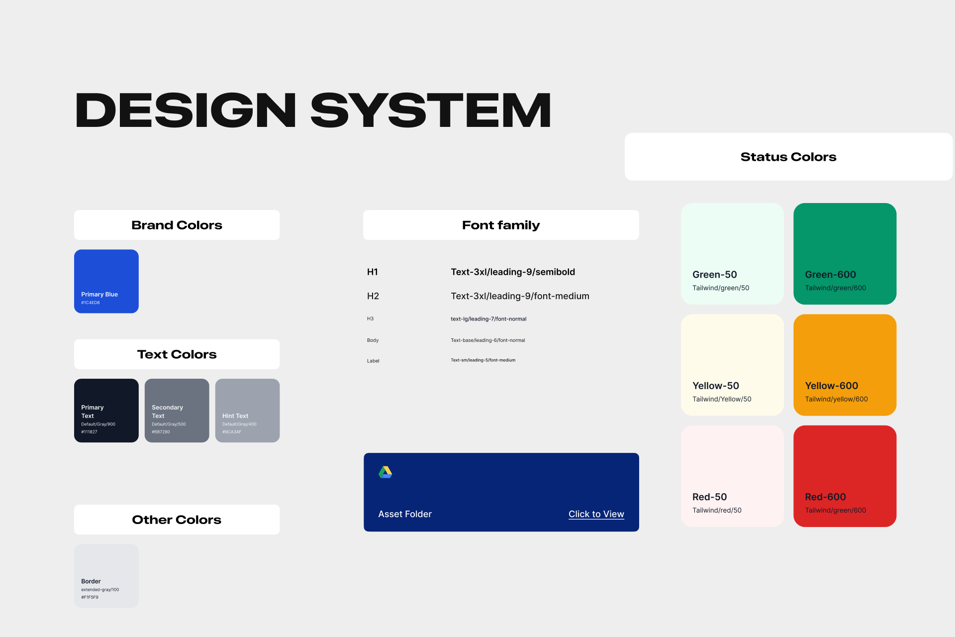
Design System Foundations
A shared set of rules ended the cycle of revisiting the same visual decisions on every screen.
I also worked directly in the codebase. In a team this small, the difference between a decent screen and a trustworthy one comes down to the last mile — spacing, alignment, copy, loading states, empty states. I could not design these in Figma and hope they survived handoff.
The workflow was simple: devs implemented core functionality, I refined the UI using the design system, and we shipped. No heavy handoff documents. Just continuous improvement, screen by screen.
At the same time, I designed the marketing site in Figma and built it in Framer — learning the tool as I went. That was uncomfortable at first, but it was the right trade-off for the speed we needed. I also redesigned the logo, shaped the visual identity, and created pitch decks, social graphics, and promotional materials. A pre-seed company shows up in a dozen places before a customer ever logs in. Every touchpoint needed to tell the same story.
The live site is at divacs.com.
The Gain
The product started to feel like one thing instead of several parts moving at different speeds. The design system gave the team a shared vocabulary for making decisions. The brand showed up consistently from the product to the pitch deck to the website.
More importantly, the team could put the product in front of people without caveating the experience. That shift — from "ignore how it looks, let me explain" to "here, try it yourself" — is the real measure of what changed.
The work was not flashy. It was foundational. We took something promising but rough and turned it into something that earned trust on its own terms.
Reflection
This project taught me what it means to be the first designer at a company. There is no system to inherit, no precedent to follow. You figure it out while doing the work.
What made it meaningful was the stage. At pre-seed, every decision compounds. The design system shaped how the team thought about building everything after it. The research gave me context to challenge assumptions the team had stopped questioning.
DIVACS trusted me with that responsibility before I had proven anything to them. That kind of bet goes both ways, and I think we both came out ahead.