
Case Study - Inteliome : Making an early AI data product easier to use
Inteliome began as a way to chat with a PDF and grew into a broader data product. I helped simplify the experience, shape the interface, and build a design system the team could keep using as the product expanded.
- Client
- Inteliome
- Year
- Service
- Product Design, Design System, Branding
Overview
In late 2022, before chat based AI tools felt normal, Inteliome was exploring a simple idea: upload a document, ask a question, and get useful answers in plain language.
The first version centered on chatting with PDFs, but the ambition was bigger. The team wanted a product that could help organizations work with large, messy, and often sensitive data without forcing people through complicated workflows.
I joined as lead product designer during an early six month phase of the project. I worked across product design, UI, UX, branding, and frontend polish with a small research team that later grew as the product expanded.
What I did
- Product Design
- Design System
- Web App Design
- Mobile App Design
- Branding
The Goal
Inteliome did not need to feel futuristic. It needed to feel usable.
The team wanted a conversational data tool that could fit into real company workflows. That meant helping people move through complex data without feeling lost, and doing it in a way that felt trustworthy enough for internal testing, funder conversations, and early adoption.
There was also a second goal that became obvious very quickly. If the product kept growing into external data sources, agents, and more chat flows, we needed a design foundation that could keep up.
The Gap
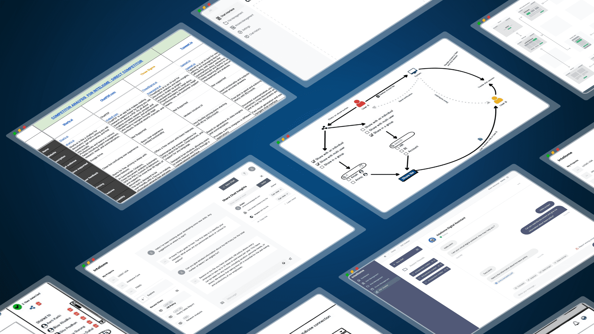
The early concept moved fast. We were designing and testing ideas while the product was still being defined. We did not have time for deep research at the start, so many early decisions were based on assumptions, quick feedback loops, and competitive analysis.
That part was messy, but it was honest. We were trying to get enough signal to move forward.
Once the first internal MVP existed, the main problems became clear. People needed too much time to learn basic flows. The interface felt crowded. Patterns were inconsistent. The product could do interesting things, but it asked too much from the user.
The problem was not a lack of features. It was cognitive load.
The Gamble
My first instinct was not to make the product look more advanced. It was to make it feel more familiar.
We borrowed interaction patterns people already knew from everyday workplace tools such as Microsoft Teams, Gmail, and Slack. We broke larger flows into smaller steps, used progressive disclosure, and redesigned key screens so users could focus on one decision at a time.
I also pushed for accessibility early. We considered people with lower vision, lower computer confidence, reduced dexterity, and lower tolerance for clutter. That changed how we handled type, spacing, contrast, and screen density.
At the same time, I started shaping a design system with shared tokens and reusable patterns. That work mattered as much as the screens themselves. It gave design and engineering a common language and made collaboration less wasteful.
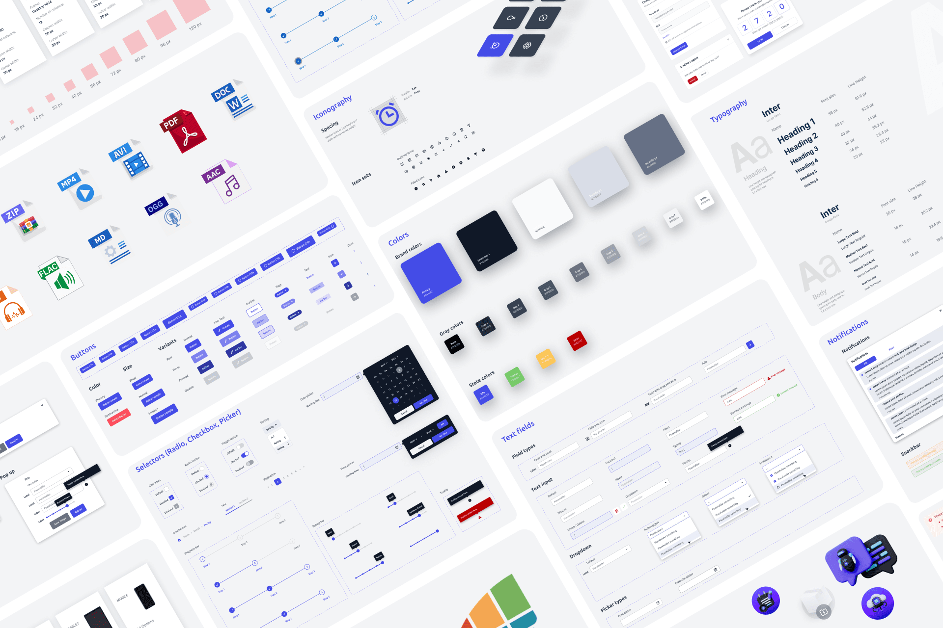
Design System
Shared tokens and reusable patterns gave the team a more stable foundation.
Because I had a frontend background, I stayed close to implementation. Talking through flows with developers early saved time, exposed bad assumptions, and kept us from designing things that looked good in Figma but made little sense in code.
On mobile, we did not try to shrink the whole desktop product. We chose the tasks that mattered on the go and left the rest out. That restraint made the mobile experience clearer.
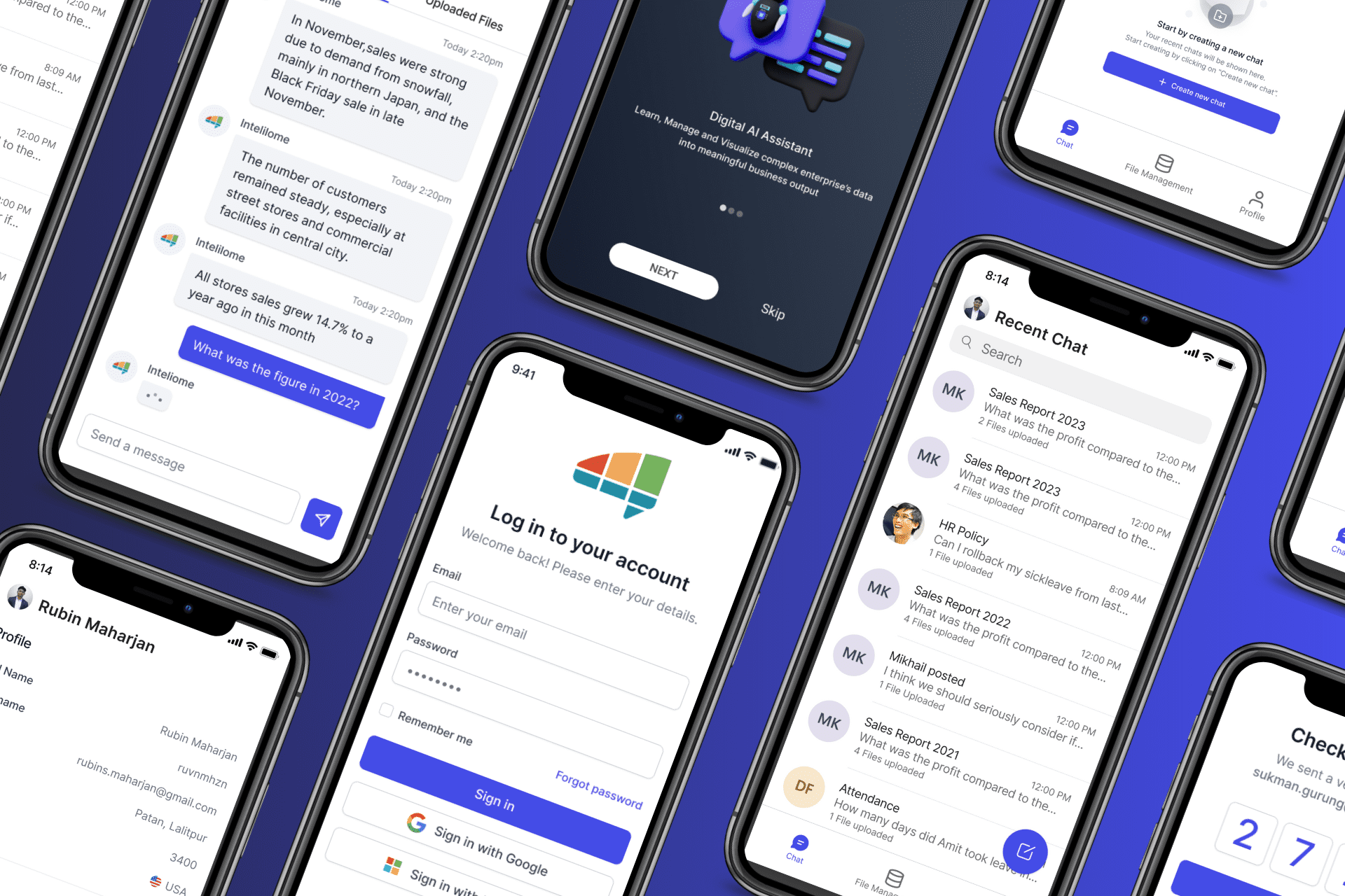
Mobile App
On mobile, we focused on the tasks that mattered most instead of shrinking the full desktop product.
The Gain
The biggest change was not that the product looked cleaner. It became easier to learn, easier to discuss, and easier to keep building.
Users were less overwhelmed during testing. The team had a clearer way to talk about components and interaction patterns. Design reviews became more about product decisions and less about fixing avoidable inconsistency. Handoff got smoother because more of the system was shared up front.
As the platform grew beyond PDF chat into external data sources like Snowflake and Salesforce, data agents, and more complex workflows, that foundation helped the product stay coherent.
There was no neat finish line. Even by February 2024, we were still iterating, still testing new ideas, and still finding things that did not work. But the project stopped feeling chaotic all the time. That was real progress.
Reflection
What I like about this project is that it does not make sense as a polished success story. The early phase was fast, uncertain, and sometimes frustrating. We made decisions with incomplete information. We changed direction. We learned in public.
That is also why the project matters to me. It taught me how to design when the brief is still moving, how to reduce complexity without pretending the problem is simple, and how much better the work gets when designers and developers stop acting like separate camps.
I am proud of the system we built, but I am more proud that we kept making the product clearer as the scope grew. That felt honest. And it made the work better.